top of page


RIDICULOUS FUN
BRANDING a summer camp for kids. Each illustration is created to be used independently as stickers or together in promotional material. Posters, banners and mailers are designed to jump out to kids with wild colors, relentless energy, and characters that were ready to play yesterday!


"PERHAPS A DIVINE ENCOUNTER IS WHAT YOU LONG FOR"
EVENT BRANDING for a weekend retreat to beautiful conversation, artistic expression, and wonderful food for the women of King's Way UMC. A distinguished & feminine approach with the beatuiful space in mind dictated the direction for mailers, postcards, posters, signage, and social media promotion.


"A FIELD-DAY FOR SPRINGFIELD"
EVENT BRANDING for a community-wide day of fun to celebrate warmer weather and Springfield itself! An illustrative approach is used to communicate to a fun-loving crowd, and little nods to the event's location and landmarks are sprinkled in. The promotion includes posters, every-door-direct-mailers, signage, facebook ads, and website graphics. Rain or shine, the people came ready for slip-n-slides.

"GOOD SAUCE FOR GOOD PEOPLE"
LOGO DESIGN for Springfield-local sauce makers with roots between Missouri, Arkansas, and Texas. The company starts with a duo of friends and a fond spot for the Texas-Arkansas interchange which was a must for the brilliant cooks' brand. The logo keeps multiple formats and platforms in mind for a simple transition to marketing, product production, and merchandise. Try the strawberry chipotle bbq sauce!


KEEP TRACK OF INTERNMENTS, ENGRAVINGS, MAINTENANCE, & MORE


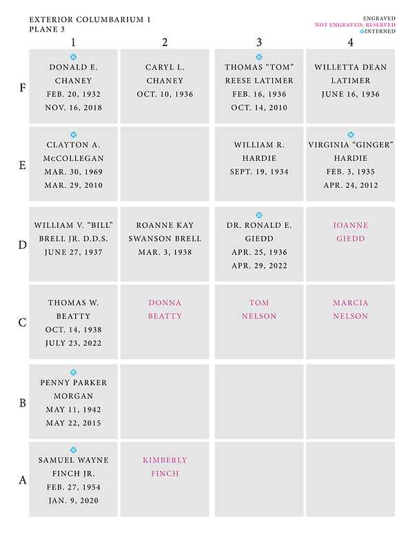
COLUMBARIA NICHE LOG


"A HOME FOR THE DEPARTED"
CATALOG SYSTEM & DESIGN for columbaria internment homes. This includes niche logs, engraving guides, niche applications, contact rolodex, and columbaria financial logs. Mistakes can't be made; this work asks to be clear, concise, and devoid of flair to keep the emphasis on practicality.

"SEWN WITH LOVE"
LOGO to a local chapter of Project Patricia—a mission to hand stitch cloth together to create reusable maxi-pads for African women in need. It comes as little surprise the logo asked to be created by hand while representing patched together love for other women.


"AN ICON THAT SHINES THROUGH"
BRANDING with primary and secondary logos for a church moving forward. From the beginning of this project, an emphasis was placed on bridging the gap between long-time members and future guests. A sunburst establishes a strong, bright icon to catch the eye, and the primary logo uses negative space to imply the shape of a cross—a must have for the long-time members. Digital and print mediums were kept in mind to market to the surrounding Glendale community, and a system to promote events and classes was built using the new branding as a foundation for the GBC sun to rise from.


"PLANTING SEEDS"
BRANDING for a financial campaign based on the growth and cultivation of the next generation. In an effort to promote engagement and funding towards the programming of the children's wing at KWUMC, this campaign asks members how they will be able to contribute to tomorrow's future.

bottom of page